Project Brief
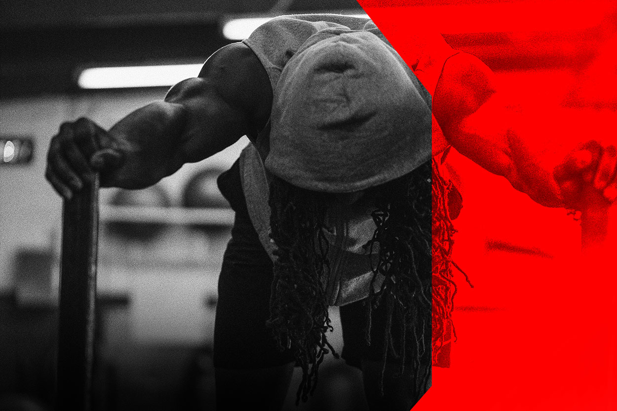
F.I.T. needed an upgrade to attract higher-end clientele. It's current branding was subpar and lacked professional creative direction. Their current execution left quite a bit to be desired and it was evident due to the lack of response from would be consumers.
Concept
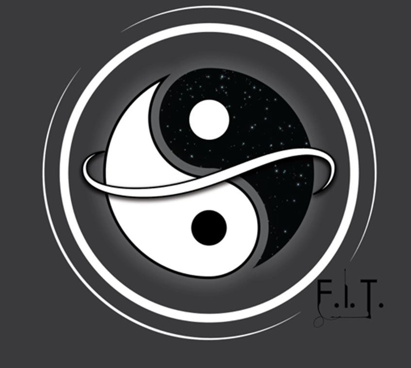
The founder of F.I.T. identified with the Ying Yang symbol as his way of life. In his mind, life is about balance, which is why fitness is life. The body defies the laws of physics, another reason why he feels balance is so important regarding the human body.
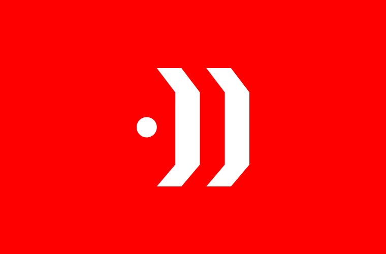
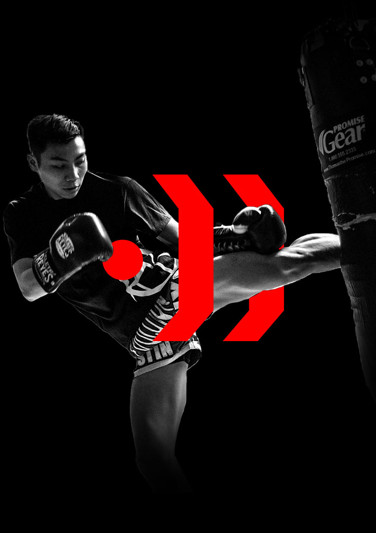
When it comes to the execution, the logo uses the ying yang symbol as influence. The circle represents the human body moving forward. The two edges represent the two sides of the ying yang. F.I.T. is the balance maintained while building the body.
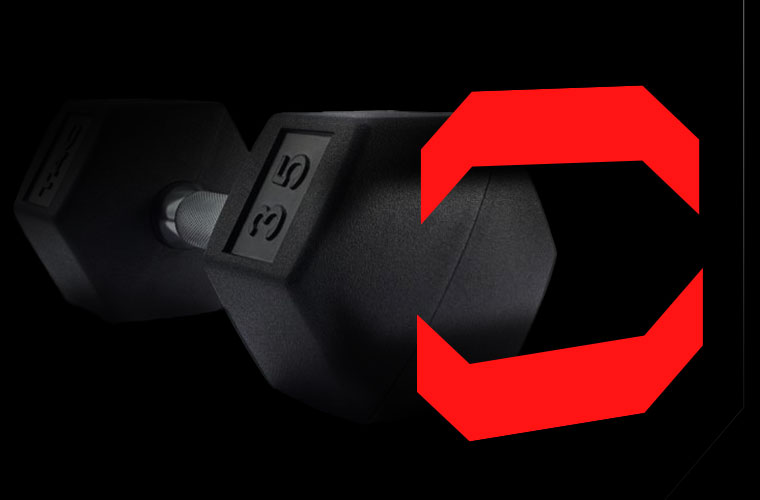
We angled the edges to represent hexagon dumbells to bring the concept back to the gym.
Identity
Old Logo
New Logo
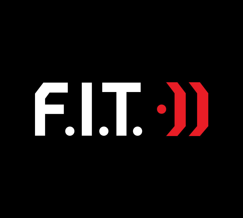
The old image is not a logo. It's a graphic image. There are differences between logos and graphics. The different types of logos are abstract, wordmark, symbol or iconic, letter mark or combination mark. None of these fit the old design. As for the new logo it's a combination mark of a wordmark and an icon. It's balanced and has a commanding presence.
Brand Colors
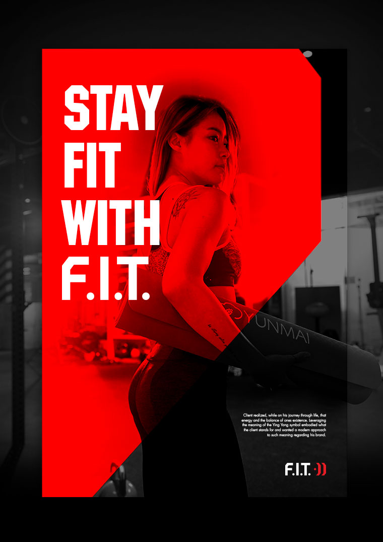
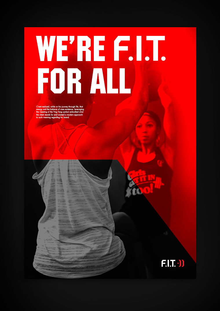
The red, black and white combination are strong color options portraying energy, power and emotion. Using the colors as overlays and strong contrasting elements in layout give it an exciting and energetic feel.
-
Black
RGB: #000000
-
White
RGB: #ffffff
-
Red
RGB: #d32326


Designer & Art Director / Mark-Anthony Marshall
United States Marine Corps veteran turned creative problem solver. With his 10 years in advertising & marketing as a creative consultant, he has the ability to help in several categories of design and strategy.
View Profile

