Project Brief
Courvoisier realized their demographic was a beneficial one but no longer accepted its current brand position. Elevating their brand to a higher status was an overall goal. And in doing so they wanted to acquire the urban millennial. Those recent graduate world travelers. In order to do this several things needed to be created. A strategy, concept and story, campaign, look & feel and media elements.
Concept
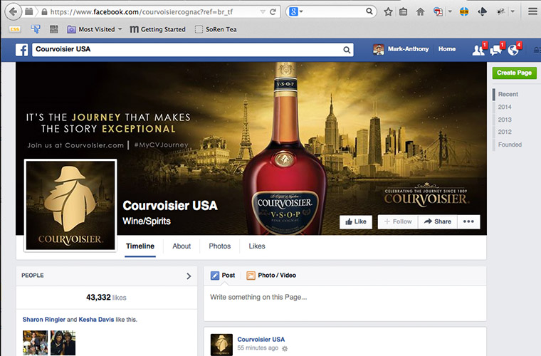
The concept story chosen was, the Exceptional Journey. We realized its not just about Courvoisier but also about helping everyone define their exceptional journey.
The challenge, create something premium and visually interesting. The single most important thing to communicate is, "Own your passions, whatever you do, do it well, and be proud of it. Courvoisier has a legacy of excellence and so should you.
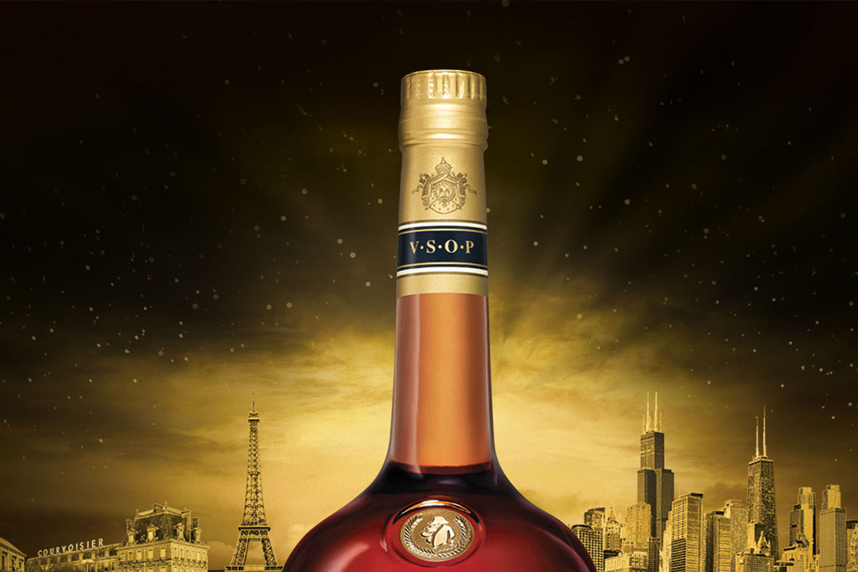
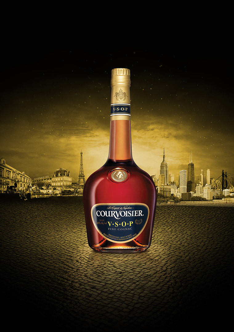
On the left is the story of Courvoisier in Jarnac and on the right is the story of those within different cities nationally. Everything is encased in gold for the premium feel and the overall image is silhouetted for visual appeal.
Skylines
National

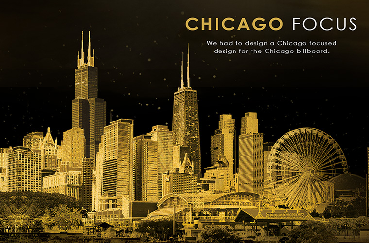
Chicago

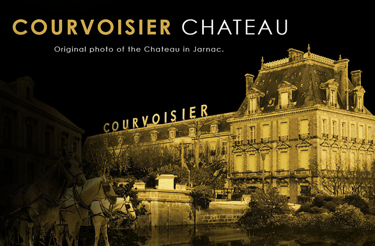
Jarnac France Courvoisier

Because this was a national campaign for Courvoisier we had to show the key city skylines in one layout, Chicago on its own and Jarnac on its own as well. Then we applied these to the different layouts required for the out of home advertising elements.
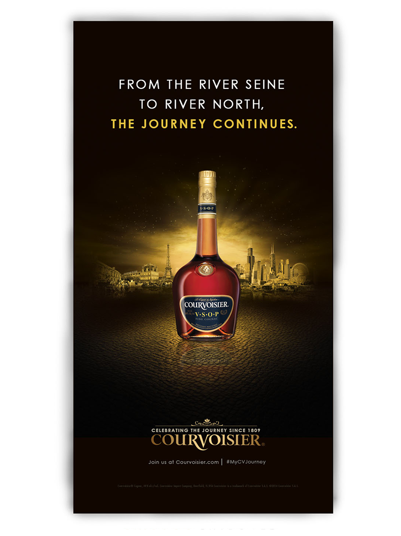
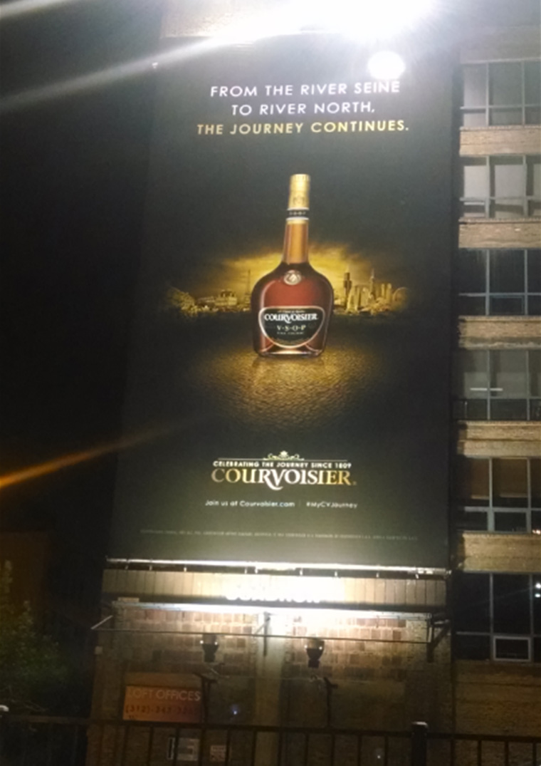
Chicago Focused Billboard
Chicago's skyline is comprised of the Willis Tower, Navy Pier and the Hancock tower among several other buildings, which you'll see to the right.
The visuals are strong in this billboard layout for Chicago specifically but its the copy, which brings it all together.
National Billboard
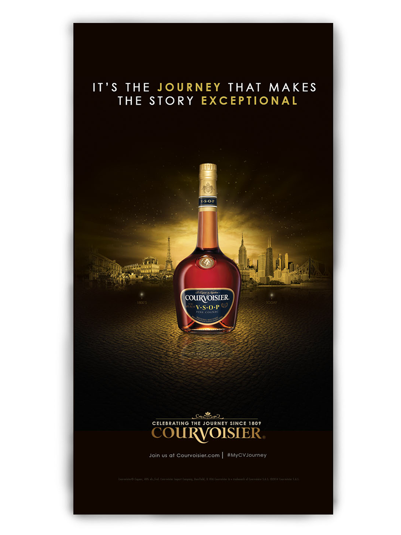
The national billboard displays all of the key city skylines together within the same layout. Being that this is the national billboard the placement for this was higher than the Chicago focused billboard.
As with the Chicago version, the copy does the heavy lifting here as well on explaining the concept of everyone’s story and the journey.
Creative Strategy & Elements
When developing the elements, it was imperative to maintain an upscale feel. Every detail from the color of the images, the color gold to the copy was under a microscope during development.
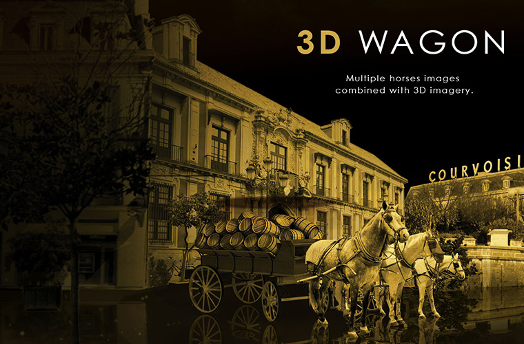
We used visualwright studios to develop the renders within this layout. The attention to detail was tested on this project and they came through for us.
-
Gold
RGB: #D1A900
-
Gray
RGB: #808080
-
Black
RGB: #000000



Designer & Art Director / Mark-Anthony Marshall
United States Marine Corps veteran turned creative problem solver. With his 10 years in advertising & marketing as a creative consultant, he has the ability to help in several categories of design and strategy.
View Profile

